The indigenous representative of India turned to the designer Katie Stepanova, he has been living in Moscow for 10 years, and speaks freely in Russian. He wanted to create an authentic project in Moscow for his friends and connoisseurs of Indian cuisine.
| The author of the project | Katie Stepanov |
|---|---|
| Year of implementation | 2024 |
| Place (city, LCD, etc.) | Moscow, shopping center Kyiv |
| Meter | 160 |
| Stylistics | Indian |
| The number of rooms | 2 |
| The number of bathrooms | 2 |
| The height of the ceilings | 4m |
Initially, in this room there was another restaurant there, so we already got the main finish ready. But she was in a gray-black loft, which did not fit our bright concept at all. So there were a lot of colors in the interior.
Katie Stepanovdesigner.
It will come here
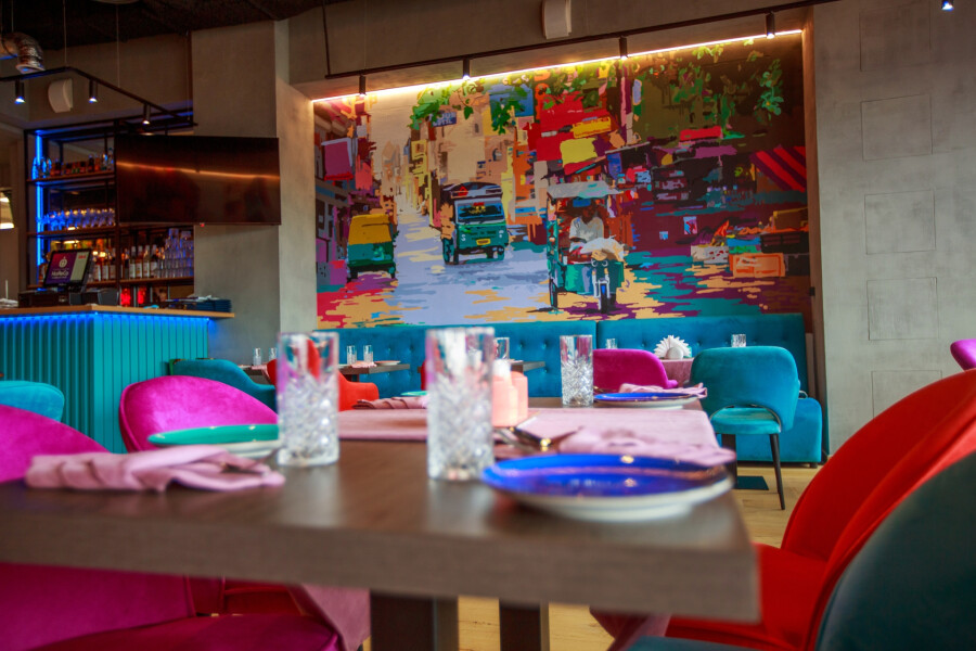
The interior of the room is quite modern, but fully transfers the energy of the Indian city
It will come here
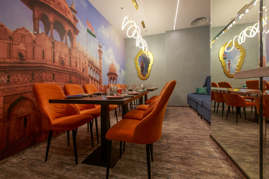
The restaurant has a small VIP room with photo wallpaper of Indian attractions
Read also: How to make a visually expensive interior with minimal investments?
Some of the ideas were proposed by the customer, and the designer developed a concept for him, consisting of 3 options. After the coordination of one of the options, they immediately began design.
It will come here
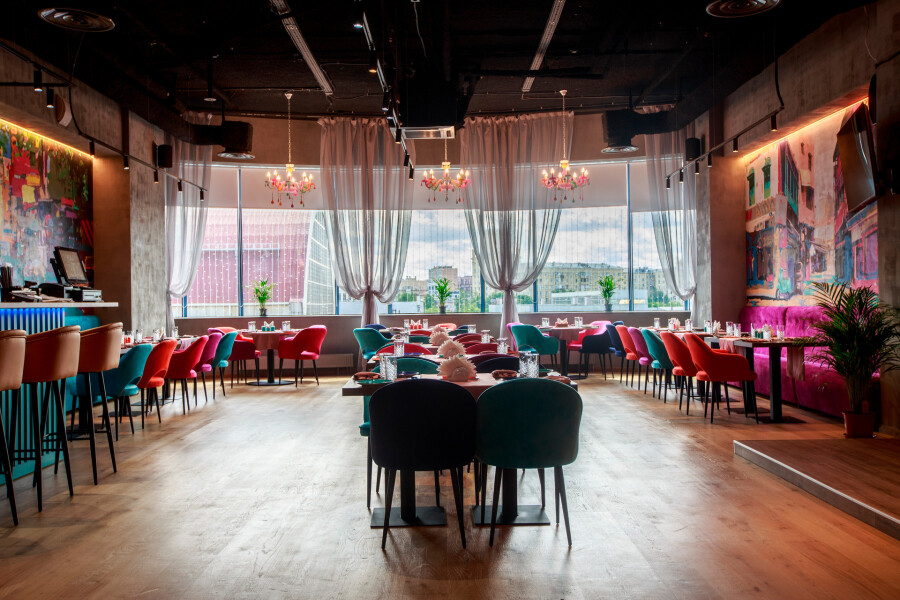
Great plus of the room – panoramic windows overlooking the city
Read also: The best combinations for any interior.
I chose light textile because large panoramic windows are always a big plus in a restaurant, I wanted to leave them to the maximum.
On the walls – a painting made to order an interior artist. I gave her a task, picked up references and, on their basis, she made sketches and further painting. Initially, it was these colors and in such quantities appeared from multi -colored chandeliers that hang by the window. This is the first subject-attachment that I found for the interior and it served as a starting point for creating the whole concept. That is, the colors on the chandelier flow into painting and the color of upholstered furniture, as well as a bar rack and reception so that the space is combined and solved in the same color scheme.
To have a balance in the interior and there is no overload on color, I recommend using colors in a dosage, as accents. Although experienced designers can make a completely bright and multi -colored interior and it will look harmonious.
Katie Stepanovdesigner.
It will come here
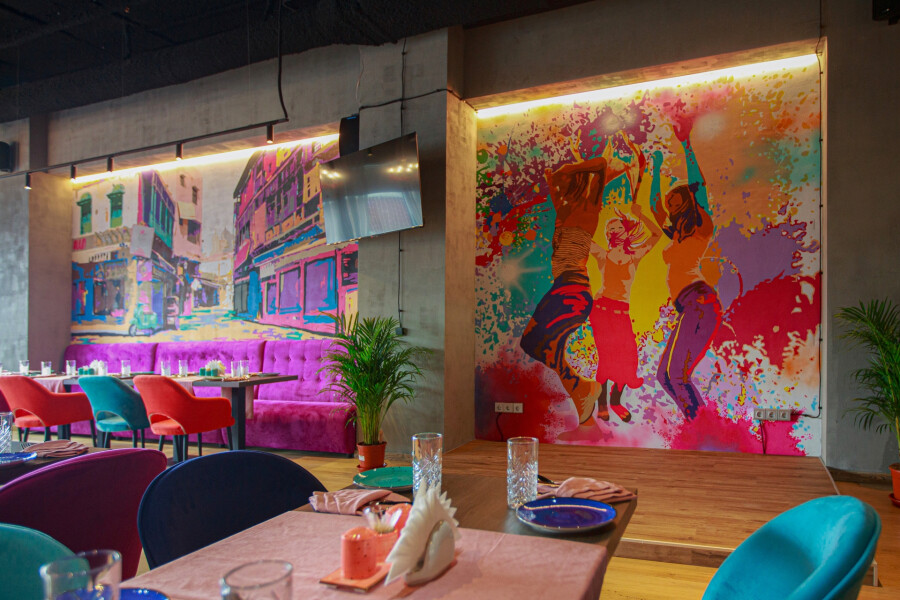
On the walls – a painting made to order an interior artist
According to Katie, the most not profitable shades for catering are purple and lilac. They soothe, suppress appetite and are more suitable for institutions where people will relax, than have fun.
It will come here

Already entering the institution, visitors fall into the bright and colorful world of India
Read also: Daring plan: bold interior solutions from gloss pages.
Since I was trained in the design of restaurants in Milan, Italian architects (one of the best in the world) laid me a basic understanding of lighting design, which should be used in any catering establishment to create a cozy atmosphere. This rule lies in the fact that the surfaces of tables and dishes should be highlighted, and not the light pouring face. Thus, the guest feels solitary, while well sees what is on a plate. For this, directed spots with an angle of dispersion of not more than 9-15 degrees are usually used. Also, the restaurant temperature is very important in the restaurant – it must be warm. Since in cold lighting food does not seem fresh, and the faces of people look painful.
Lamps, sconces, floor lamps are usually used in restaurants as decorative light, and not as functional.
Katie Stepanovdesigner.
It will come here
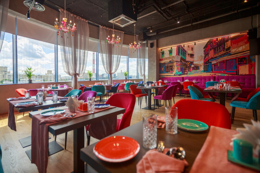
The air conditioner and the ventilation system are easiest to hide, painting them in the color of the ceiling. Especially if you have open communications
The mirror panel was made to order according to the designer sketches. It is inspired by classic Indian ornaments. Katie placed him opposite the window in a place where there is not enough light. And due to the reflected light from the window, the space is more illuminated. Also, the pink finish of the panel passes into the pink stance of the reception, as if a little masking it on the side.
It will come here
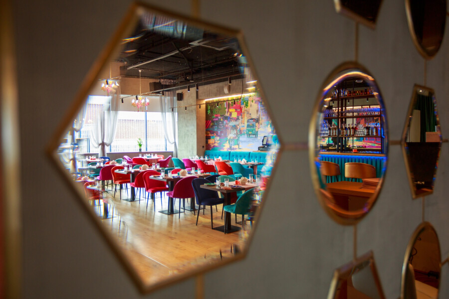
The mirrors in the hall have not only a decorative function, but also add the room of light, as they are located opposite the windows
The colors of the dishes and table textiles repeat our selected colors in the interior, as if supplementing with accents and bringing the desired dynamics to the space. Glossy textures add shine, luxury to the restaurant.
Katie Stepanov, designer.
It will come here
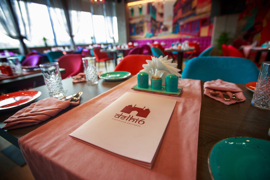
In the main hall you can see chairs of four saturated shades
Read also: First coworking for designers in Sochi: a bright project from Rif Design.
Wall murals in the VIP hall is an image of the Indian attractions Red Fort. It was the customer who wanted to use her, she was also on the restaurant logo. From this image, I pushed back when creating the design of the VIP room. It differs from the main hall, wears more calm and muffled shades. Katie used blue and orange as basic colors (secondary to the color of the fortress).
We got the mirror wall from the past room. She is in good condition and I decided to leave her, since large mirrors in a small room always work to expand the space, which played into our hands.
Katie Stepanovdesigner.
It will come here
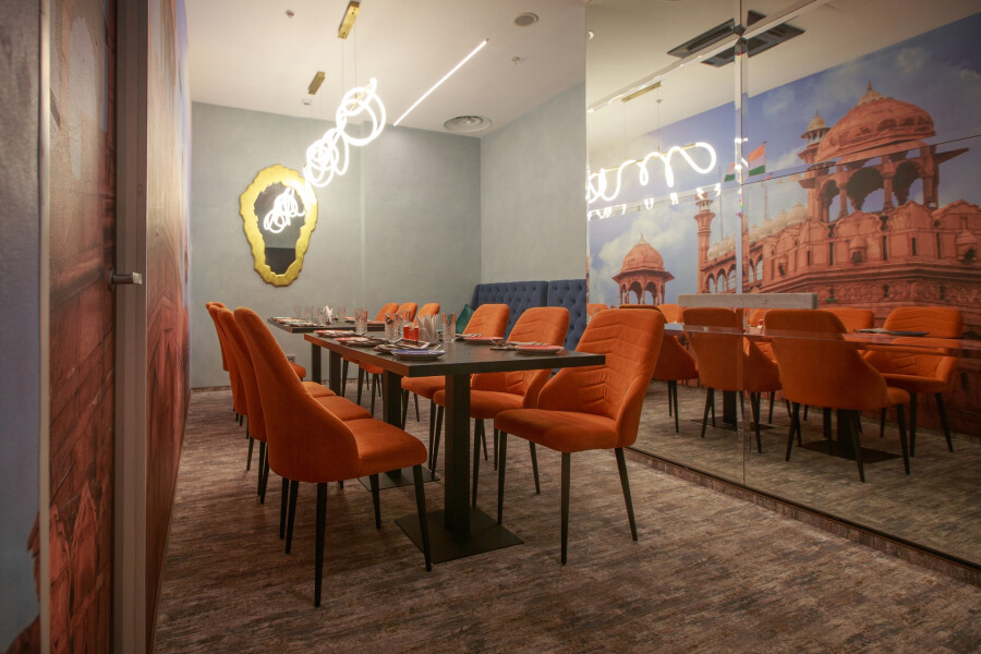
Since the room of the VIP hall is small, the designer decided to avoid the riot of colors there and made the interior more calm
The development of the project took about two months from Katie, it took four more. The approximate cost of sales amounted to 15 million rubles.
It will come here
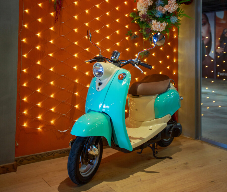
The turquoise scooter reminds us of the busy streets of India
Read also: “Inspiration in crispy crust of hot bread”: Interview with Shushana Khachatryan.
