Depending on the chosen combination, two -tone curtains can become an interesting interior solution, bringing the atmosphere of comfort to various rooms, creating a festive mood and becoming assistants in modeling the space.
Rules for combining colors in curtains
There are three basic principles of color combination:
- Contrast – This principle is more suitable for people creative and bold, making extraordinary decisions. One of the bright tones in this case will be designed to set the mood for the entire room, to become the main accent.
- Nuanced combinationE – when shades of the same color create visual unity. Examples of such combinations: dark blue and cornflower, saturated green and olive, burgundy and pale pink.
- Delicate paletteA is a classic solution, when the main tone of the room sets the color to the curtains, and the second color of the curtains is selected in accordance with the rules for a combination of colors and shades on the palette. Sometimes the color scheme complements neutral pastel, beige or white.
Two -color curtains in the interior
In the common room where we meet guests, the spirit of solemnity should be hung, because two -tone curtains for the living room should be rather contrasting, consisting of several paintings – light and dark.
 |
 |
 |
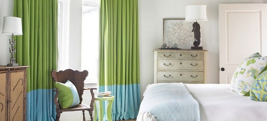
The situation with the rest room is completely different. In the bedroom, two -tone curtains should contribute to relaxation and rest. Therefore, contrasts here are not appropriate. The nuanced combination or selection of colors closely located in the color palette is soon suitable.
 |
 |
 |
Two -tone curtains for the kitchen should be functional, for example – to the windowsill length. The option of two -tone curtains on the grommets or a combination of tulle and roller or Roman curtains is ideal. As for the color combination, the light curtains of pastel colors with more dense curtains of a saturated shade look great.
 |
 |
 |